wwwmwww
User

Posts: 1,231 | Re: Screen captures...
on Friday, April, 01, 2005 12:37 PM
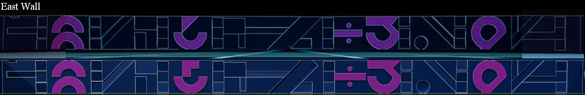
East wall is done.
Enjoy,
Carl
 where to buy abortion pill ordering abortion pills to be shipped to house buy abortion pill online
|
Boingo_Buzzard
User

Posts: 0 | Re: Screen captures...
on Friday, April, 01, 2005 2:01 PM
Pretty cool. I always liked the division symbol. I thought it was kinda quirky.
abortion pills online http://www.kvicksundscupen.se/template/default.aspx?abortion-questions cytotec abortion

|
wwwmwww
User
Posts: 1,231 | Re: Screen captures...
on Saturday, April, 02, 2005 7:08 PM
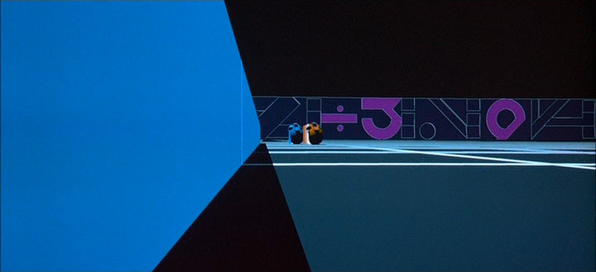
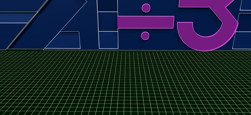
Here is the south wall...
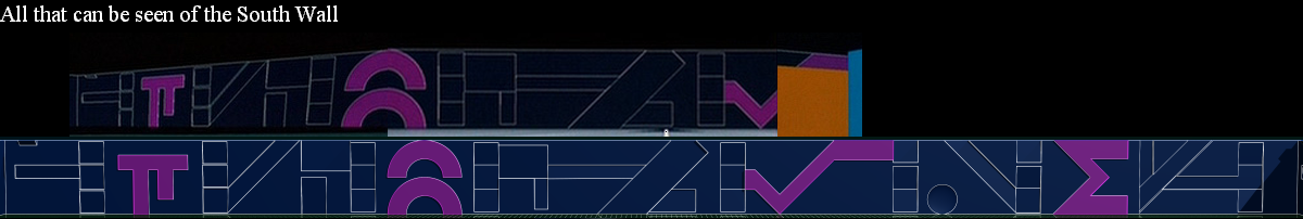
The last symbol is a capital Sigma or "summation" symbol. I thought it fit well into the font of the numbers. What do you think?
Enjoy,
Carlorder abortion pill abortion pill buy online where to buy abortion pill
|
wwwmwww
User
Posts: 1,231 | Re: Screen captures...
on Sunday, April, 03, 2005 12:11 PM
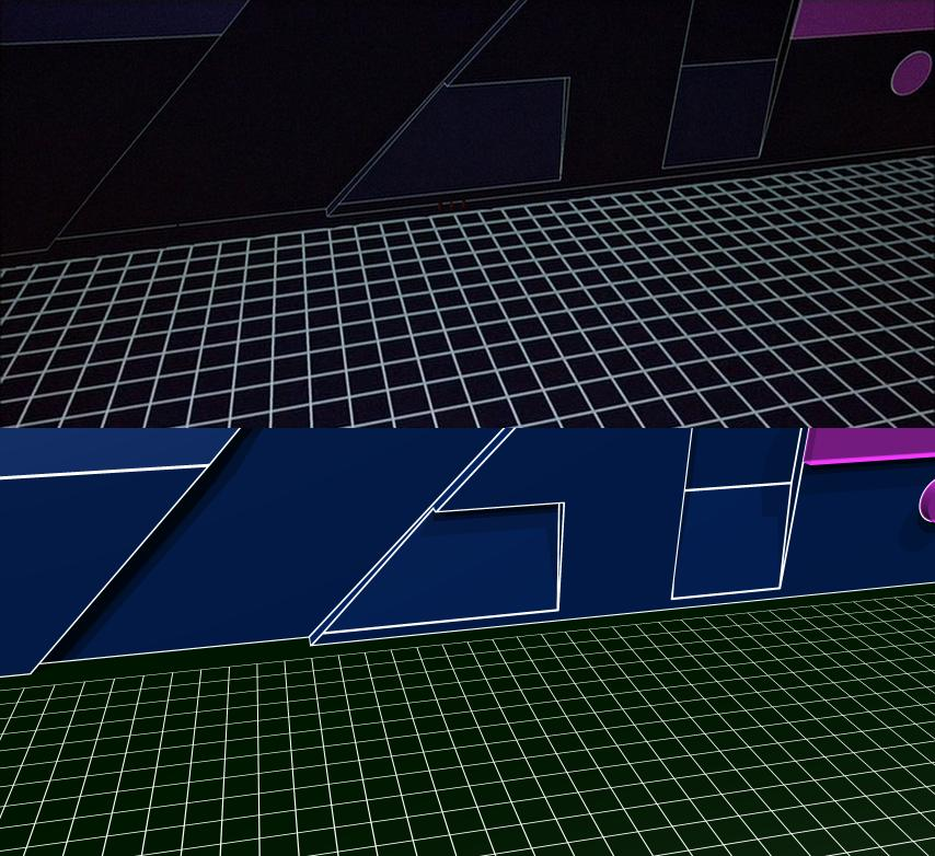
Taking a quick look back at the east wall for a second I wanted to point something out.
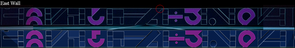
Notice the red circle. It looks like I modeled that piece wrong as it's different then the 3 other walls. However I'll argue it shouldn't be different. Look at this pic:
Here you see the east wall and that part looks like all the others. As I pointed out earlier in this thread it's not the only problem with the east wall. It changes again after the crack is formed next to the 3.
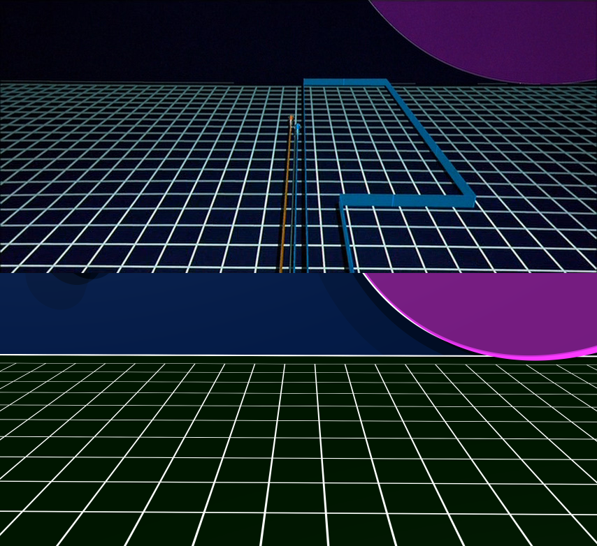
Oh and one other thing that looks odd in that screen capture. Where do the trails for the orange and blue bike on the left go? It looks like they've just started leaving a trail which we know shouldn't be the case.
Interesting...
Enjoy,
Carlwhere to buy abortion pill http://blog.bitimpulse.com/template/default.aspx?abortion-types buy abortion pill online
|
TheReelTodd
Sector Admin

Posts: 0 | Re: Screen captures...
on Sunday, April, 03, 2005 2:44 PM
All the walls are looking GREAT, Carl! 
Your attention to detail is pretty dead on, and it works well given that you've modeled your game grid walls with the original Syd Mead font concept.
| wwwmwww Wrote:...The last symbol is a capital Sigma or "summation" symbol. I thought it fit well into the font of the numbers. What do you think? |
Yep - it looks like it belongs there! I think it's a great fit.
abortion pills online abortion pill online purchase cytotec abortion
 
|
TheReelTodd
Sector Admin
Posts: 0 | Re: Screen captures...
on Sunday, April, 03, 2005 2:50 PM
wwwmwww Wrote:Taking a quick look back at the east wall for a second I wanted to point something out.
Notice the red circle. It looks like I modeled that piece wrong as it's different then the 3 other walls. However I'll argue it shouldn't be different. |
I agree with that. I think you've got a better grip on the game grid wall continuity than they did at the time. They probably did just place the light cycles on the grid generically for each shot, not making much notice of the walls and directions, as you had stated before I believe.
wwwmwww Wrote:Oh and one other thing that looks odd in that screen capture. Where do the trails for the orange and blue bike on the left go? It looks like they've just started leaving a trail which we know shouldn't be the case.
Interesting...
|
Wow - great find! So many times I've seen the light cycle competition and I don't ever recall noticing that error. It does indeed appear as if the light cycle jet walls are just starting out right behind them. I'm sure it was a bit harder to keep track of everything like that given the primitive tools they had to work with. They probably had to play the "it's only a few frames - no one will notice it" card here and there. Heck, I play that card all the time in my work! 
|
wwwmwww
User
Posts: 1,231 | Re: Screen captures...
on Tuesday, April, 05, 2005 11:15 AM
| TheReelTodd Wrote:I think you've got a better grip on the game grid wall continuity than they did at the time. |
Thanks... when I spoted the above I think I spoted another continuity error. I'm in the process of making a few renderings to see if I'm correct. Here is my first "comparison" shot. The camera isn't placed quite correctly to get an "exact" copy of the frame from the film but it's close. It's close enough to prove the point I'll make when I have my second comparison shot to post. If I'm right it will be a little harder to "fix" this continuity error.
Enjoy,
Carl
P.S. I turned off the reflectivity of the floor just for this comparison. It got in the way of the comparison I'm wanting to make.
|
TheReelTodd
Sector Admin
Posts: 0 | Re: Screen captures...
on Tuesday, April, 05, 2005 7:44 PM
Wow - your light cycle game grid recreation is pretty dead on, Carl!
You've even got the grid squares properly proportioned - very nice!
Looking at the dimensions of your wall detailings, they look pretty damn close to the film version. Aside from the fact that you've lit your game grid walls a little more (making them look brighter), that's one VERY accurate recreation!
Slight difference in thickness of your detailing lines and the film's - yours appear to be slightly thicker. And your grid squares are slightly thinner looking. It is looking sweet though!
For what its worth, I like the game grid floor better without the reflection - it's more TRON-like that way. 
I know you're still working on the walls, but I just can't wait to see your animations of light cycles INSIDE your newly modeled game grid arena!
order abortion pill abortion pill buy online where to buy abortion pill
|
wwwmwww
User
Posts: 1,231 | Re: Screen captures...
on Tuesday, April, 05, 2005 10:46 PM
| TheReelTodd Wrote:Wow - your light cycle game grid recreation is pretty dead on, Carl! |
Thanks.
| TheReelTodd Wrote:You've even got the grid squares properly proportioned - very nice! |
Not really... you'll see what I mean soon.
| TheReelTodd Wrote:Looking at the dimensions of your wall detailings, they look pretty damn close to the film version. Aside from the fact that you've lit your game grid walls a little more (making them look brighter), that's one VERY accurate recreation! |
Yes, I've noticed in the close up shots the walls look almost black. In the distance shots they look blue.
| TheReelTodd Wrote:Slight difference in thickness of your detailing lines and the film's - yours appear to be slightly thicker. And your grid squares are slightly thinner looking. It is looking sweet though! |
Well most of this has to do with the way I'm drawing the lines. In my model they are being ray traced. In TRON I think they used a procedure like we talked about before to add the lines in after the rendering. In my model the lines will get thinner and thinner the farther way the camera is moved. So they look real big close up yet you can still see them when you are in the middle of the game grid. In TRON they seem to always be the same width regardles of the distance to the camera. It's like the red lines on the recognizers. The grid lines do look narrow from this distance but they look correct to me up close. Again I think the width of the lines isn't being adjusted for correctly in TRON. Notice that when the camera is close to the grid in the movie, the horizon looks like its becoming solid white instead of black yet 95% of the grid is black and only about 5% is white. The horizon should tend toward black... not white. So again I'm pretty sure those lines aren't ray traced, they are getting procedurally added to the image after the actual ray tracing is done.
TheReelTodd Wrote:
For what its worth, I like the game grid floor better without the reflection - it's more TRON-like that way. |
It's easy enough to turn on and off. It sure makes the rendering faster too when it's off.
TheReelTodd Wrote:I know you're still working on the walls, but I just can't wait to see your animations of light cycles INSIDE your newly modeled game grid arena!
|
Still have one wall to model. Then I'll make a few fly-by animations to see how she looks then I'll start putting the bikes in. However before I get to the other wall I still need to make the image that goes with the one I just posted that shows the "problem" I think I've found.
More when I have some time,
Carl
|
TheReelTodd
Sector Admin
Posts: 0 | Re: Screen captures...
on Wednesday, April, 06, 2005 6:25 PM
wwwmwww Wrote:| TheReelTodd Wrote:You've even got the grid squares properly proportioned - very nice! |
Not really... you'll see what I mean soon. |
Hmm. Ok, they looked pretty close. I counted the number of squares between the indentation on the left side to be 10 squares in the TRON film frame and in your rendering. The alignment of the squares (on each end) also seem to be in sync. Is your comment a case of your squares not being exactly to very close to the film grid squares, or is it a case of the film squares kind of change size in different shots?
| wwwmwww Wrote:I've noticed in the close up shots the walls look almost black. In the distance shots they look blue. |
Yeah - I think the walls in the film are blue, but they're generally not well lit and appear very dark at times. Like I said, I think you just lit your walls with brighter light source for lack of a better way of putting it.
| wwwmwww Wrote:In TRON I think they used a procedure like we talked about before to add the lines in after the rendering. In my model the lines will get thinner and thinner the farther way the camera is moved. So they look real big close up yet you can still see them when you are in the middle of the game grid. In TRON they seem to always be the same width regardless of the distance to the camera. It's like the red lines on the recognizers. The grid lines do look narrow from this distance but they look correct to me up close. Again I think the width of the lines isn't being adjusted for correctly in TRON. Notice that when the camera is close to the grid in the movie, the horizon looks like its becoming solid white instead of black yet 95% of the grid is black and only about 5% is white. The horizon should tend toward black... not white. |
That's a good point - I think you hit the nail on the head with that. In the film, the lines are generally always a constant weight regardless of how far or close to the camera. And I know exactly what you mean about the grid lines looking all filled in in the background - I had noticed that too. I figure they did that so the grid lines would not look odd when they became smaller than the size of a pixel. It would have caused a very erratic-looking pattern-in-motion had they not done it the way they did, if that makes any sense. I'm sure POV-Ray will handle it better than the technology they had to use at the time.
| wwwmwww Wrote:Still have one wall to model. Then I'll make a few fly-by animations to see how she looks then I'll start putting the bikes in. |
I'm really looking forward to the animations once you've gotten the "problem" area worked out. This is going to be really cool!
Keep up the good work!
|
wwwmwww
User
Posts: 1,231 | Re: Screen captures...
on Thursday, April, 07, 2005 11:45 AM
| TheReelTodd Wrote:Hmm. Ok, they looked pretty close. I counted the number of squares between the indentation on the left side to be 10 squares in the TRON film frame and in your rendering. The alignment of the squares (on each end) also seem to be in sync. Is your comment a case of your squares not being exactly to very close to the film grid squares, or is it a case of the film squares kind of change size in different shots? |
You hit the nail on the head. Look at this picture:
There are basically two areas where the light cycles interact with the wall. At the begining of the match and the area near the base of the 3 where the crack forms. I mactch up great for the begining shots but I'm off by more then a factor of two for the other shots. So there are a couple concerns I have in determining which size I should use.
My grid size is already 520x520. If a light cycle covers 1 unit per frame of film and I use a frame rate of 24 fps it takes 21.66 seconds for a light cycle to just travel from one side of the grid to the other. If I show a match in real time it sounds like there could be some very slow moments. However I want to model the recognizer and its only seen against the wall of the arena near the end of the match. If I use my current arena my wall will look like it's less then half the size it should be compared to the recognizer. Then again who is to say the recognizer size is consistent in the film. The size relationship between the light cycles and the tank isn't. The other point being is there are a lot more shots near the base of the 3 then there are at the begining so I'm afriad my arena might look too small but the begining is where I can most easily match the grid size to features on the wall and if I make it any bigger, making a movie of a live match would seem rather slow if its not already to that point. I think I'll stick with the grid size I'm currently using and see where I stand with the wall height problem after I model the recognizer.
Carlabortion pills online abortion pill online purchase cytotec abortion
|
TheReelTodd
Sector Admin
Posts: 0 | Re: Screen captures...
on Thursday, April, 07, 2005 6:57 PM
So they DID scale the grid differently per shot, eh? Hmm. I wonder if they just scaled down the grid for the longer shots (without cycles) because it looked like the grid squares were too small when shown from the more distant, encompassing angles, and then used the "regular" scale for the close-ups and action shots?
Hard to say why it was done that way. Perhaps it was a simple continuity error and not intentional or even known about at the time. I'm sure they rendered the light cycle scenes out of order and learned a lot along the way and that probably affected how they proceeded with the rest of the shots (as they learned).
I guess the best way to figure out which scale to use in your game grid arena would be experimentation.
| wwwmwww Wrote:My grid size is already 520x520. If a light cycle covers 1 unit per frame of film and I use a frame rate of 24 fps it takes 21.66 seconds for a light cycle to just travel from one side of the grid to the other. If I show a match in real time it sounds like there could be some very slow moments. |
At the wide shot (larger squares) scale, you shouldn't think of the distance as 21.66 seconds, but more like 10.83 seconds as the opponents will be traveling toward each other. 11 seconds isn't a bad time because it will give you an opportunity to get in a few angles of the cycles heading toward each other, each ready to spar-off in a battle to the deresolution.
Even at the smaller grid size, you'd probably be able to fill in the time with dialogue or other cool shots of the cycles heading toward each other.
In multi-player internet light cycles, there is almost always some moments in the game as the cyclists go head to head, perform a lot of fancy moves trying to out maneuver each other, and ultimately have to circle back (or should I say square back) and come around in a different location as there is now too many jet walls in the way to continue in the previous location. This actually happens several times during a duel between two of the more skilled cyclists.
Of course, an animation (unlike a live game) would be better planned for optimal drama and excitement content to minimize the slow moments. Also, don't forget that if you have multiple cycles dueling at once, you can always stage it so that there are always intense moments between two cyclists while the other cycles move in to position for their more intense moments, etc. You know - that sounds like a lot of work and some really serious timing & planning. But it will be VERY cool and well worth the effort once completed!
Honestly, I'm sure you could make either grid size work well. I guess it's up to how you think it looks when you do some test animations.
| wwwmwww Wrote:Then again who is to say the recognizer size is consistent in the film. The size relationship between the light cycles and the tank isn't. |
I think the recognizer was pretty consistently sized in the film... but then again, we generally only saw them near the light cycles and a tank - and it's already been established that the cycles and tanks were not always proportioned the same. I guess it's a matter of doing your research and checking for exactly what size the recognizer seems to best resemble hot large it appeared in the film.
In the film, the recognizer did seem pretty small in comparison to the light cycle arena walls, and very large compared to the light cycle - in the same sequence. Yeah - you'll have to work this one out. I'm looking forward to the test renderings! I know, it may be a while, but I'm in no rush - it's all fun!
|
wwwmwww
User
Posts: 1,231 | Re: Screen captures...
on Friday, April, 08, 2005 8:52 AM
Just to tie the above two comparison together I made this image.
It shows you that the region of the wall where they start really isn't that far away from where the crack forms.
Carl
|
wwwmwww
User
Posts: 1,231 | Re: Screen captures...
on Friday, April, 08, 2005 9:29 AM
| TheReelTodd Wrote:So they DID scale the grid differently per shot, eh? Hmm. I wonder if they just scaled down the grid for the longer shots (without cycles) because it looked like the grid squares were too small when shown from the more distant, encompassing angles, and then used the "regular" scale for the close-ups and action shots? |
It's hard to say. Based on the story boards my guess would be that they released they needed taller walls for the recognizer to come down from and have time for its legs to turn around and come together. So they just enlarged the walls without going back and redoing the beginning.
| TheReelTodd Wrote:Hard to say why it was done that way. Perhaps it was a simple continuity error and not intentional or even known about at the time. I'm sure they rendered the light cycle scenes out of order and learned a lot along the way and that probably affected how they proceeded with the rest of the shots (as they learned). |
I'm not sure why but this has me wondering... Are the light cycles themselves always the same size relative to the grid spacing? ...atleast while on the game grid? I'm not sure. As for why they did it this way... again my guess is they had a number of models... be that the tank, the light cycle, the arena, etc. And probably for each shot they wanted to match the story boards as best they could. Someone would probably say "This shot would look better if the tank was a little bigger or the light cycles were a little smaller." and I just get the feeling that relative size consistency wasn't that important to them. Each shot was probably tuned without too much regard to the others. It's nothing against them... errors like this would probably never been discovered had someone else not tried to copy their models.  And I'm sure that was the last thing they were thinking about back then.
| TheReelTodd Wrote:I guess the best way to figure out which scale to use in your game grid arena would be experimentation. |
Yes, it's always something that's trivial enough to change after I've start playing with it. However once I start making little shorts I'd like to nail all the sizes down... atleast so I'm consistent within each short/animation.
| TheReelTodd Wrote:I think the recognizer was pretty consistently sized in the film... but then again, we generally only saw them near the light cycles and a tank - and it's already been established that the cycles and tanks were not always proportioned the same. I guess it's a matter of doing your research and checking for exactly what size the recognizer seems to best resemble hot large it appeared in the film. |
I think once I get to that point of starting that model I'll work from the shot where the recognizer cuts through the bridge that has a tank on it. I'll use that to adjust it's size relative to the tank and from there see how it looks next to the light cycles and the wall of the arena. Anyone got any good screen captures of the recognizer cutting through that bridge? Maybe it's best to ask that question in my recognizer thread once I get to that point. I don't want to get that cart too far ahead of the horse.
Carlon line abortion pill misoprostol dose abortion medical abortion pill online
|
Sketch
Sector Admin
Posts: 2,939 | Re: Screen captures...
on Friday, April, 08, 2005 9:32 AM
Your game grid rendering look fantastic Carl. Can't wait to see the finished product.
https://www.flickr.com/photos/blue_bezel/
|
TheReelTodd
Sector Admin
Posts: 0 | Re: Screen captures...
on Friday, April, 08, 2005 7:01 PM
Well, you've got some work ahead of you, Carl.
I'm looking forward to the comparison/text renderings I'm sure will be coming when you have the time.
Interesting how a seemingly simple thing such as recreating the light cycles, game grid, and other TRON vehicles has turned in to a major analysis of scale, size, and proportion thing like this. Amazing how none of us caught this when we saw the film over and over and over... until someone started trying to model the vehicles, etc. It just goes to show how the mind ties things together, even when they don't necessarily fit. This reminds me of the Millennium Falcon from Star Wars. The "full scale" version of it was really only about 60% or 70% of the size it should have been considering the close-ups of the cockpit and interior portions of the ship. And no one questioned that for the longest time either. Of course, that size difference was probably for the obvious reason of making the ship full scale would have taken up too much room on a sound stage, but still interesting.
Thing in the film TRON world may not exist in a constant scale, but things in the recreation will be... and they'll ROCK!
abortion pills online abortion pill online purchase cytotec abortion
|
Tori
User

Posts: 0 | Re: Screen captures...
on Friday, April, 08, 2005 7:08 PM
Wow....those are neat..
They remind me of that Armegetron game in a way...
order abortion pill morning after pill price where to buy abortion pillabortion pills online abortion questions cytotec abortion
==
|
TheReelTodd
Sector Admin
Posts: 0 | Re: Screen captures...
on Friday, April, 08, 2005 7:12 PM
Tori Wrote:Wow....those are neat..
They remind me of that Armegetron game in a way...
|
Well, I would think they would since Armegetron is based on the light cycles sequence in TRON.
Fun game (Armegetron) - I've played it. Not quite light cycles, it's a lot slower, but fun. on line abortion pill misoprostol dose abortion medical abortion pill onlineorder abortion pill abortion pill buy online where to buy abortion pill
|
Tori
User
Posts: 0 | Re: Screen captures...
on Friday, April, 08, 2005 11:15 PM
TheReelTodd Wrote:Tori Wrote:Wow....those are neat..
They remind me of that Armegetron game in a way...
|
Well, I would think they would since Armegetron is based on the light cycles sequence in TRON.
Fun game (Armegetron) - I've played it. Not quite light cycles, it's a lot slower, but fun. |
It's very addictive...
Once you start playing it, it's really hard to get yourself to stop...
on line abortion pill misoprostol dose abortion medical abortion pill online
==
|
Boingo_Buzzard
User
Posts: 0 | Re: Screen captures...
on Saturday, April, 09, 2005 1:22 AM
Plus... besides Tron 2.0 it's the only online multiplayer light cycles game I know of.
right?
|
|